
The Challenge:
With the proliferation of smartphones, people are now taking more photos than ever before. Some of these photos document people and life events that are important to us, and these photos we hope to keep indefinitely. However not all photos we take hold the same importance. Increasingly we are taking photos, not only for the sake of creating an archive of our lives, but for other reasons. We might take a photo as a note to self, or to share information with other people. These photos, while important in their own right, are not necessarily photos that we want to keep forever. We take them because they are useful, but they lose their importance once it serves the intended use.
With a finite amount of storage on our phones and photo library that grows daily, it is important to make sure that we are keeping the photos that are important to us, and getting rid of the photos that are not. However, it is often difficult remembering to delete the photos that we no longer need. The challenge for this project was to design an app that would help users maintain an organized photo library and prevent the overcrowding of obsolete photos.
The Solution:
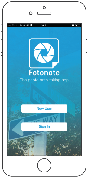

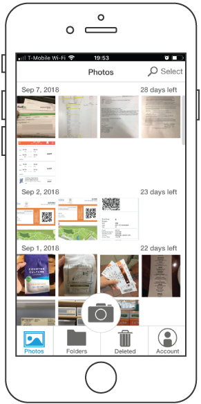

Fotonote is an app that focuses on task-based and disposable photos, designed to enhance these photos’ usefulness while also preventing them from crowding the user’s photo library. Fotonote achieves its goals through four key functions:
Photographs taken in Fotonote do not show up in users’ photo library, instead being kept within Fotonote's internal app storage. This way users can expect to find all their photo notes in one place.
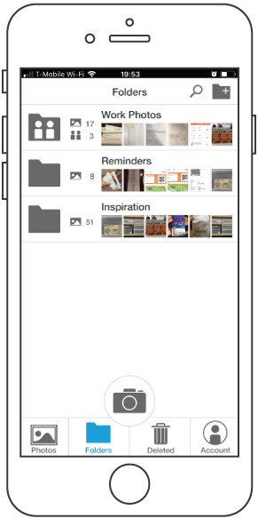
Notes can be added to photos and folders created within Fotonote. These notes can be shared with other Fotonote users by creating shared folders.
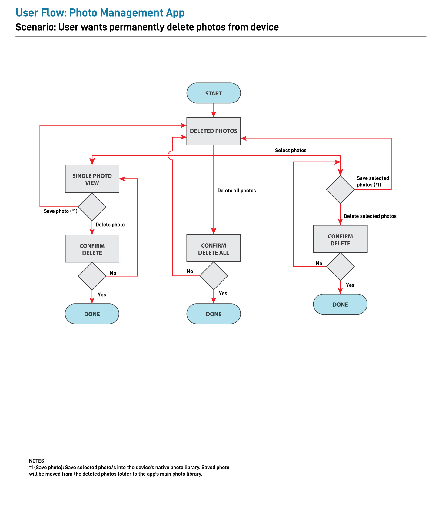
Each photo taken within Fotonote has an expiration date, after which the photo is automatically deleted. This prevents old and obsolete photos from taking up space on users’ phones.
Users can “Star” photos that they want to keep. Starring a photo will deactivate their expiration dates, and also save the photo in the user’s phone’s photo library.
The Research:
To identify modern smartphone users’ photography habits, an online survey was conducted with 20 participants. The survey asked five basic questions regarding their current smartphone, how many photos they have on their phone, and their smartphone camera use in their everyday life.
Results of this survey showed that 60% of the participants took photographs on a daily or every other day basis, and nearly half of the participants have over 3000 photos in their photo library. 75% of these participants admitted to feeling the need to delete photos, suggesting that modern smartphone users are facing a problem of an ever-growing photo library.
In order to better understand what sort of photos are accumulating in users’ photo libraries, six survey participants who a) actively or semi-actively take photos in their daily life, b) have a large number of photographs saved on their phone, and c) feel like they have too many photos were contacted for a subsequent interview.
When asked what they used their cameras for, the most common answers were a) to document personal memories (photos of friends and family, and life events), and b) as a tool for visual note taking (by way of using their camera to document ticket numbers, wifi passwords, confirmation codes, parking spots etc.). Photography as a means of social communication (where users take photos to send to friends and loved ones), and photographing various things for work (documents, receipts, competitor samples etc.) were also popular uses noted by many of the participants.
These “visual notes” were also the photos that participants deleted most often, and seemed to be a primary cause in the clutter occurring within their photo libraries.
Noting that visual note-taking was a common practice among modern smartphone users and that these photos were a big factor in these users’ growing photo library, I saw the potential in an app designed specifically for these visual notes, and decided to explore this concept further.
Persona:


Based on the research information gathered through this survey and interview, an empathy map has been created to break down the various interview responses, and from that a persona was developed. Stephanie, my persona, is a mid-20s female living away from home in a metropolitan city living an active lifestyle. Her smartphone camera is an everyday fixture in her busy life, not only for documenting memories, but also to keep record of concert tickets and confirmation numbers, as well as a way to keep in touch with friends back from her hometown. With so many photos taken every day, she finds it hard to keep her photo library from being overwhelmed by photos that she forgot to delete.
Card Sorting and Mapping Out the App:
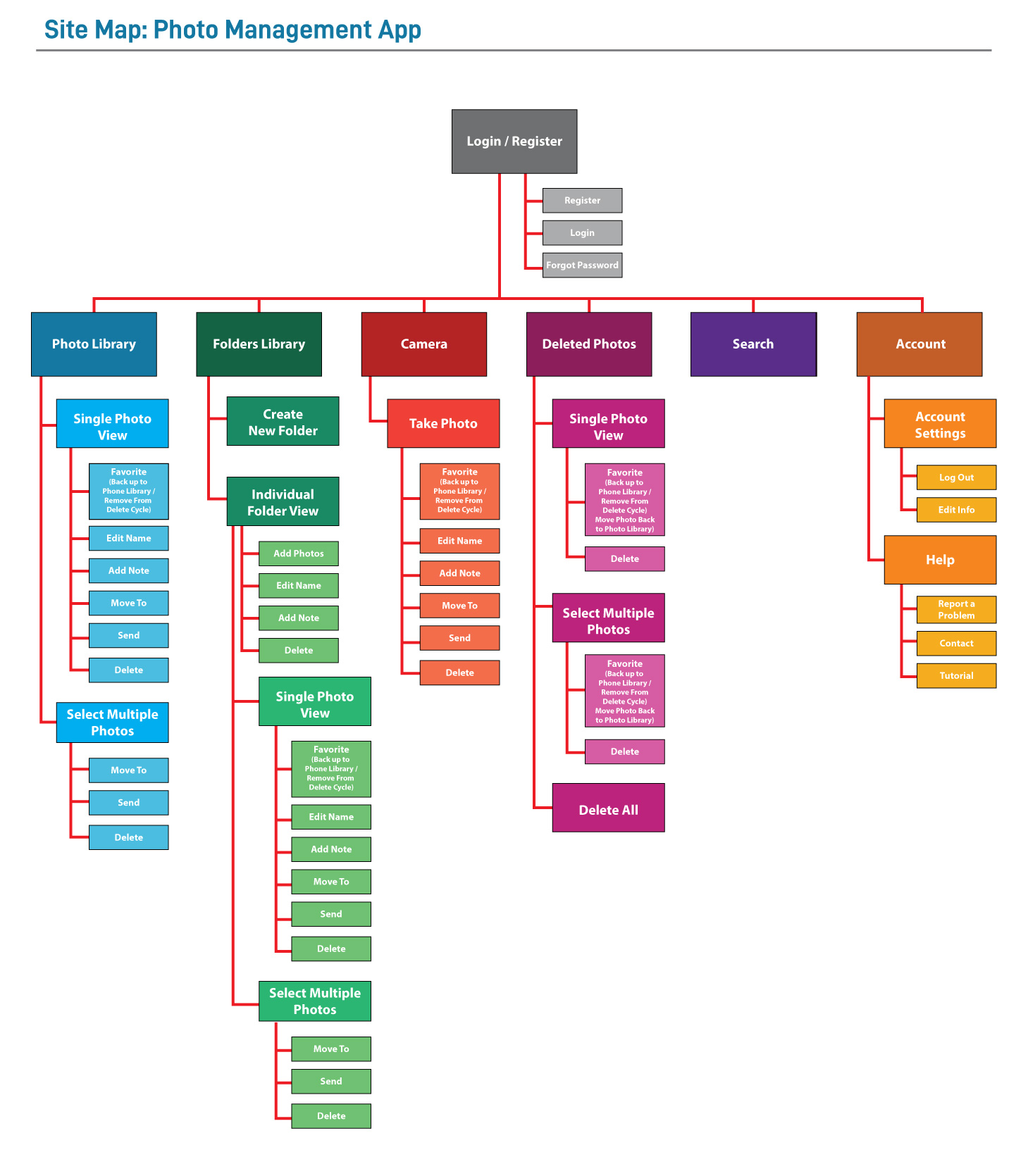
Once my persona was created, I began developing the basic framework to my photo note-taking application with Stephanie’s needs in mind. The various functions required for the app were written down on cards and four participants were recruited for card sorting sessions in order to determine the basic structure of the application. Through the information gathered in these card sorting sessions, a site map and user flow maps were created.


Wireframing and Prototyping:
Wireframes were first sketched out by hand to determine the general aesthetic and layout. After the general layout of the app was decided upon, these sketches were converted into vector graphics using Adobe Illustrator and uploaded into InVision to test out the user flow. New frames were designed and added throughout this process to assure the prototype had enough functionality to convey the key features of the app.
Excerpts from Fotonote’s wireframe sketches.
Excerpt frames from Fotonote’s low-fidelity prototype.
As this application is first and foremost a photography app, it was important that the camera button remained central within the design. For the photos and notes, a card-based approach was taken to add a tactile aesthetic to the UI.
The style guide for Fotonote
Style Guide:
Before refining my prototype further, a style guide was created to determine the aesthetic and color palette of the app. As Fotonote’s main objective is to be a utility app, a minimal color palette was chosen, consisting of a series of gray tones and blue as a thematic color to be seen throughout the app. Red has been added as a pop color, primarily to be used to caution users of irreversible actions.
High-Fidelity Prototype and User Testing:
Expert frames from Fotonote’s high-fidelity prototype.
A high-fidelity prototype was created following the Fotonote style guide, and this prototype iteration was user tested by four individuals in an in-person study. Users were asked to interact with the prototype and to complete several tasks designed to test whether new users can intuitively navigate the app’s key functions. Once the user testing was completed, each participant was asked to evaluate their experience with the app and to list any thoughts that they may have regarding it.
Overall test users’ response to the Fotonote prototype was favorable. Participants navigated the app with ease and had no trouble engaging the camera and navigating the app’s basic features. There were however two big functions users struggled with:
In the first task, users were quick to go to the “send” option once taking a photo, but had a harder time intuiting that they could also share photos with other users by creating and/or uploading photos to a “shared folder”. However once users realized that shared folders could be created, users had no problem embracing the concept.
Two out of the four test users had difficulty figuring out that “Mark as done” removed the photos from the photo library. The two users who did figure this out seemed more in-tune with the “task-based” nature of the photos, while the other two found the concept to be confusing.
Next Steps:
I have since revised the Fotonote prototype, taking into account the user input gathered by the previous study. Some of the notable changes are as follows:
The action “Mark as done” has been revised to “Delete”, and similarly the “Done” icon has been revised to “Deleted”. While I thought calling this action “Mark as done” would reinforce the task-based nature of these photos, I feared it was too foreign a concept for new users, and that users would likely be more comfortable in the simple act of “deleting” a photo.
The color palette of the style guide has been revised slightly, reflecting user comments saying that the gray icons seemed too light in color.
Some icons (e.g. the dots on the right corner of the Folders) have been removed after users commented that they were misleading.
Some additional features and concepts that I would like to explore next are as follows:
The ability to adjust the photo fidelity while taking a photo, so that users can take control of how much space these photos take up on their devices.
Offer the ability to edit the expiration timer on each photo.
AI assisted advanced search and sorting capabilities.